
Understanding AI: A Guide to Explainable Artificial Intelligence (XAI)
- Zeed Almelhem

- Sep 3, 2023
- 8 min read
Updated: Jul 3, 2024
Exploring Explainable AI: From Model Visualization to ROC Curves
Introduction
Artificial Intelligence (AI) has become an integral part of our lives, revolutionizing industries and powering various applications. However, AI models often operate as "black boxes," making it challenging to understand how they arrive at their decisions. This lack of transparency can raise concerns, especially in critical domains like healthcare and finance.
Explainable Artificial Intelligence (XAI) comes to the rescue, offering techniques and tools to make AI models more interpretable and accountable. In this comprehensive guide, we'll delve deep into XAI, providing insights, techniques, and real-world examples to demystify AI decision-making.
The Black Box Conundrum
Many advanced AI models, such as deep neural networks, are often referred to as "black boxes." While they make remarkable predictions, understanding why they make specific decisions can be perplexing. This lack of transparency raises concerns in various domains:
Healthcare: Doctors may hesitate to trust AI recommendations for patient diagnoses without understanding the rationale.
Finance: Investment decisions influenced by AI may be met with skepticism if the logic behind them remains hidden.
Legal: AI systems used in legal proceedings must provide explanations for their decisions to ensure fairness and accountability.
Understanding XAI
Before we dive into practical examples, let's establish a solid understanding of XAI:
What is XAI?
Explainable Artificial Intelligence (XAI) refers to a set of techniques and methods that enable humans to understand, interpret, and trust the decisions made by AI models. XAI seeks to provide transparency and insight into complex AI algorithms.
Why is XAI Important?
XAI is crucial for several reasons:
Transparency: XAI helps make AI models more transparent and understandable, which is vital for building trust with users and stakeholders.
Accountability: In critical applications like healthcare and finance, accountability is paramount. XAI enables organizations to explain and justify AI-driven decisions.
Bias Mitigation: XAI can reveal biases within AI models, allowing for necessary adjustments to ensure fairness.
How Explainable AI Works
1. Feature Importance
One approach to XAI involves understanding feature importance. This technique ranks the input features by their contribution to the model's predictions. For example, in a credit scoring model, feature importance analysis might reveal that income and credit history significantly influence the outcome.
2. LIME and SHAP
"Local Interpretable Model-agnostic Explanations" (LIME) and "SHapley Additive exPlanations" (SHAP) are two popular techniques for explaining black-box models. They create simplified, interpretable models that approximate the behavior of the complex model for a specific instance or prediction.
3. Visualizations
Explainable AI often employs visualizations to convey insights. This includes plots, graphs, heatmaps, and decision trees that shed light on how the model reaches conclusions.
4. Natural Language Generation
In some cases, AI models generate natural language explanations, making it easier for humans to understand the reasoning behind AI decisions. This is particularly useful in medical diagnoses or legal contexts.
Practical Examples of XAI
In the following sections, we will explore practical examples of XAI techniques, showcasing how they can be applied in real-world scenarios. These examples will include:
Model Architecture Visualization: Visualizing the architecture of deep learning models for better comprehension.
Receiver Operating Characteristic (ROC) Curve: Evaluating model performance and discrimination using ROC curves.
Model Interpretation Dashboard: Building a comprehensive dashboard to understand and assess model predictions.
2D Decision Boundary Visualization: Visualizing model decision boundaries in two dimensions for intuitive comprehension.
In these four instances, we'll employ the final model developed during the project titled "Predicting Hotel Reservation Cancellations: Enhancing Revenue Management through Advanced Machine Learning". This model, aptly named 'final_model,' will serve as the foundation for all our demonstrations. Therefore, I recommend reviewing the project to gain a comprehensive understanding before proceeding further.
Stay tuned as we dissect each example and provide code snippets, explanations, and insights into their application.
1. Model Architecture Visualization
Visualizing the Blueprint of Deep Learning Models
Deep learning models, such as Multilayer Perceptrons (MLPs) and Convolutional Neural Networks (CNNs), have demonstrated remarkable performance in various applications. However, understanding their internal workings can be challenging due to their complexity. In this section, we'll explore the power of visualizing the architecture of deep learning models to gain insights into their structure.
Understanding the Model Architecture
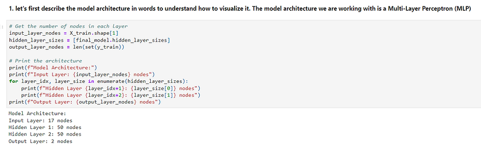
Before we dive into the visualization aspect, let's understand what we mean by "model architecture." A model architecture refers to the structure of a neural network, including the number of layers, the number of nodes or neurons in each layer, and how these layers are interconnected.
For example, consider an MLP classifier used for predicting hotel reservation cancellations. The architecture may look like this:
Input Layer: 17 nodes (features)
Hidden Layer 1: 50 nodes
Hidden Layer 2: 50 nodes
Output Layer: 2 nodes (cancellation or not cancellation)
The input layer has 17 nodes corresponding to the input features, while two hidden layers with 50 nodes each perform intermediate computations. Finally, the output layer contains two nodes, representing the prediction classes: "cancellation" and "not cancellation."
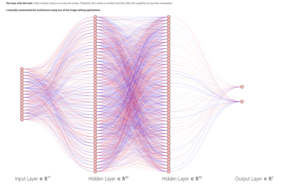
Visualizing the Model Architecture
Now that we understand the model's architecture let's explore how to visualize it effectively. Visualizing the architecture provides a blueprint of the neural network, making it easier to grasp the connections between layers and nodes.
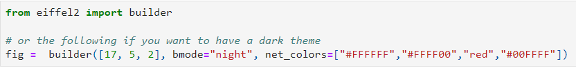
We have multiple tools at our disposal for visualizing model architectures. One such tool is "eiffel2," which offers an intuitive way to create visual representations of neural networks. Here's an example of how to use it:
2. Receiver Operating Characteristic (ROC) Curve
Evaluating Model Performance with ROC Curves
In the realm of binary classification, assessing the performance of a machine-learning model is crucial. One powerful tool for evaluating a model's classification performance, particularly in scenarios where you need to strike a balance between true positives and false positives, is the Receiver Operating Characteristic (ROC) curve.
Understanding ROC Curves
A ROC curve is a graphical representation that illustrates the trade-off between the True Positive Rate (Recall) and the False Positive Rate at different probability thresholds. It helps us visualize how well a model can distinguish between positive and negative classes across various decision thresholds.
In the context of hotel reservation cancellations, the ROC curve allows us to gauge the ability of our model to differentiate between guests who will cancel their reservations and those who won't. It's particularly valuable when you want to determine the optimal threshold for classifying instances.
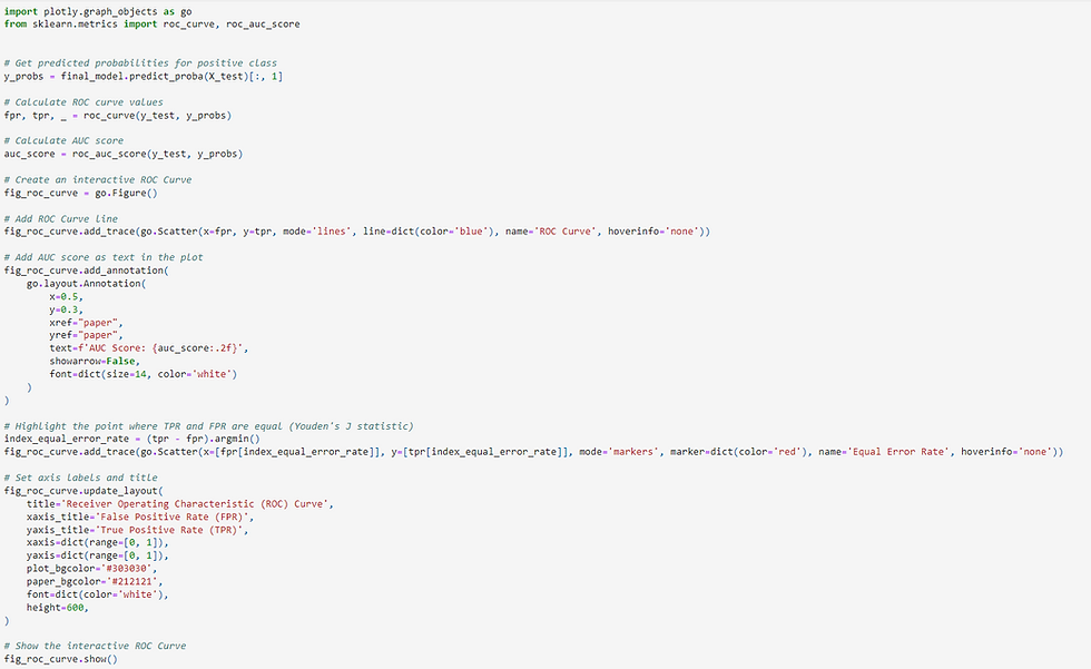
Generating an ROC Curve
Creating a ROC curve is relatively straightforward, and Python offers libraries like Plotly to visualize the curve with ease. Here's a step-by-step guide:
Obtain Predicted Probabilities: Start by obtaining the predicted probabilities for the positive class (e.g., "cancellation") from your trained machine learning model. For instance, in our hotel reservation model, we use final_model.predict_proba(X_test).
Calculate ROC Curve Values: Use the predicted probabilities and the actual labels (ground truth) to calculate the ROC curve values, specifically the False Positive Rate (FPR) and True Positive Rate (TPR). Python's scikit-learn library provides a handy roc_curve function for this purpose.
Compute the Area Under the Curve (AUC): The Area Under the ROC Curve (AUC) summarizes the overall performance of the model. A higher AUC score indicates better discrimination between classes. You can compute the AUC score using the roc_auc_score function from scikit-learn.
Visualize the ROC Curve: Finally, create an interactive ROC curve plot using plotly. The plot shows the ROC curve as well as crucial points like the Equal Error Rate (Youden's J statistic), which helps in determining the optimal threshold.
Here's a code snippet demonstrating how to generate and visualize an ROC curve:

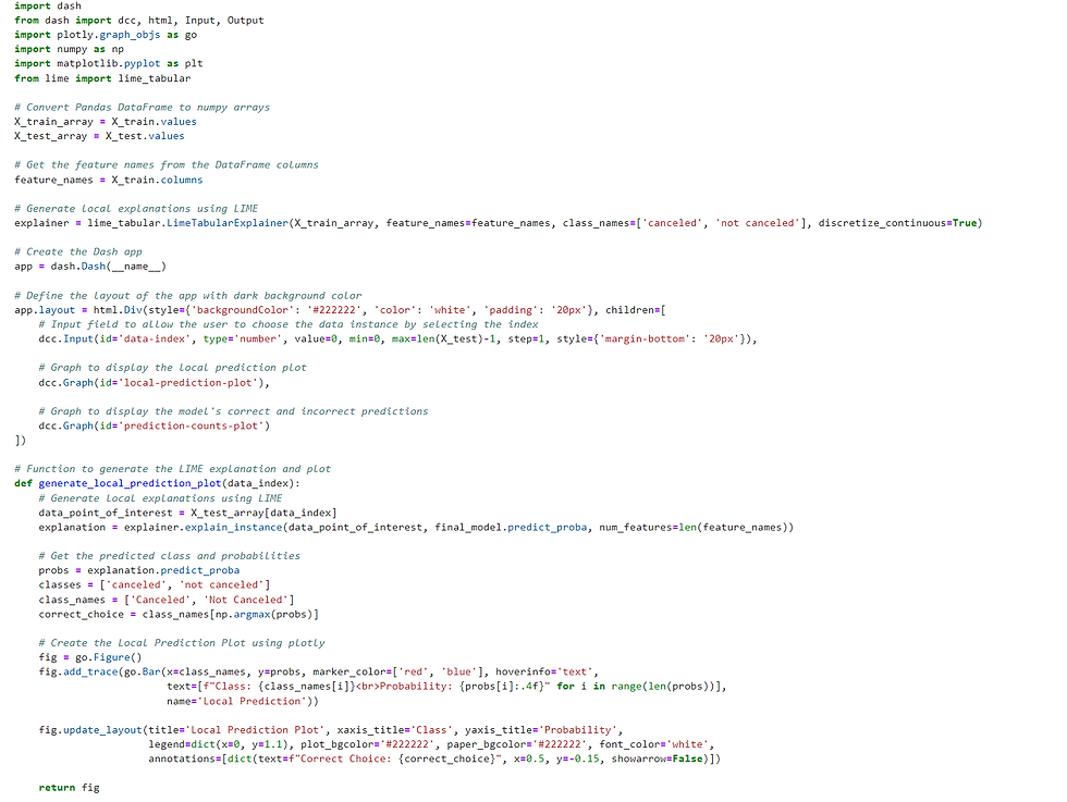
3. Model Interpretation Dashboard
Unveiling the Model's Predictions
Understanding the inner workings of a machine learning model can be akin to peering into a black box. But with the right tools, you can shed light on how your model makes predictions and explore its performance in finer detail. Enter the Model Interpretation Dashboard—a powerful tool to interpret, dissect, and analyze the predictions made by your machine learning model.
The Power of Local Interpretations
The Model Interpretation Dashboard is your gateway to understanding not just the global accuracy of your model but also its performance on individual data points. It's particularly valuable when you need to explain why a model made a specific prediction for a particular instance.
Let's dive into the key components of the dashboard:
1. Local Prediction Plot
The "Local Prediction Plot" offers insights into how your model predicts the probability of a particular class for a specific data instance. It's like taking a magnifying glass to a single prediction. You can select the data instance of interest by entering its index.
Bars: The bars in the plot represent the predicted probabilities for each class. Typically, they are color-coded, with one color for each class. For example, red might represent the "canceled" class, while blue represents "not canceled."
Hover Interaction: Hovering over the bars reveals more information, including the class name and its corresponding probability. This visualizes the model's confidence in its prediction.
Annotation: The plot also includes an annotation indicating the correct class for the chosen data instance, allowing you to quickly compare the model's prediction to the actual ground truth.
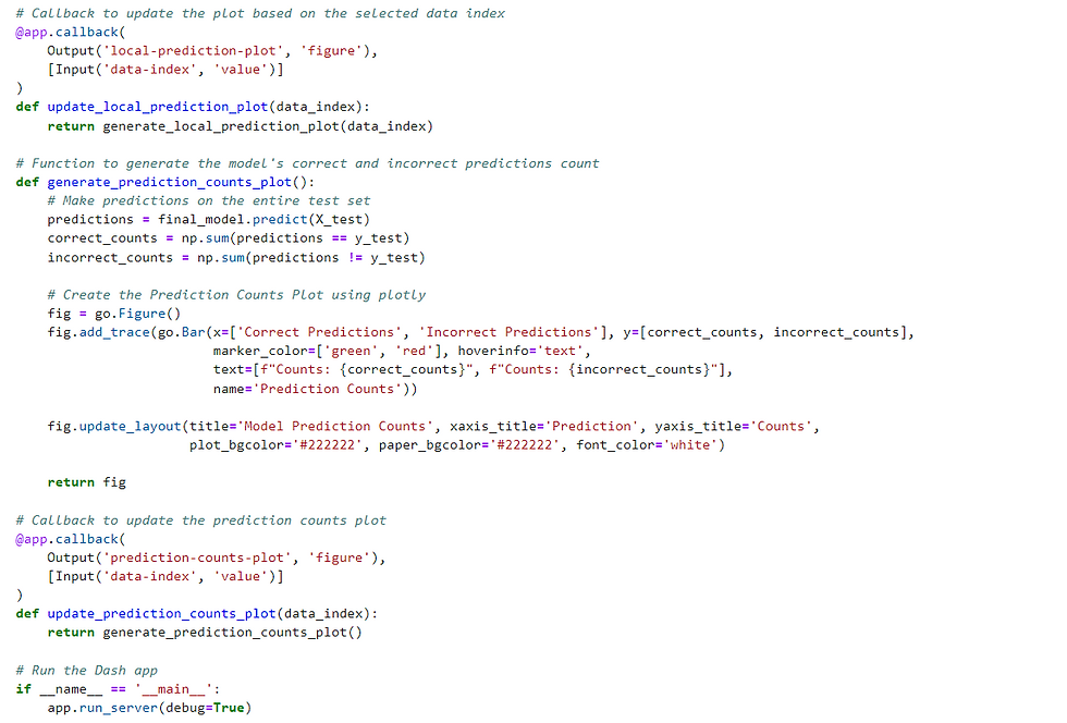
2. Model Prediction Counts
The "Model Prediction Counts" plot offers a broader view of your model's performance on the entire test dataset. It showcases the counts of correct and incorrect predictions, giving you an understanding of how well your model performs at scale.
Bars: The bars in this plot are color-coded as well. Green bars represent correct predictions, while red bars represent incorrect ones.
Hover Interaction: Hovering over each bar provides the exact count, helping you gauge the distribution of correct and incorrect predictions.
3. Incorrect Predictions Counts
The "Incorrect Predictions Counts" plot takes a closer look at where your model may be falling short. It displays the number of incorrect predictions for each class in the test dataset, pinpointing areas where improvement may be needed.
Bars: All bars in this plot are color-coded in red. Hovering over them reveals the class name and the count of incorrect predictions.
Bringing It All Together
Combining these components, the Model Interpretation Dashboard empowers you to:
Understand the model's reasoning behind specific predictions.
Assess the model's overall accuracy and identify areas of improvement.
Pinpoint which classes or categories your model may struggle with.
By using this interactive dashboard, data analysts and machine learning practitioners can gain deeper insights into model performance and, if needed, fine-tune the model for better predictions.
Below is a code snippet demonstrating how to create this interactive Model Interpretation Dashboard using Python and the LIME (Local Interpretable Model-Agnostic Explanations) library:
4. 2D Decision Boundary Visualization:
In the realm of machine learning, particularly when dealing with 2D or 3D data, decision boundary plots offer a remarkable way to comprehend how a model classifies different regions within the feature space. These plots provide a visual representation of how the model separates data points into distinct classes or categories.
To create a 2D Decision Boundary Visualization, you can follow these steps:
Select the two features of interest: Choose two features from your dataset that you want to visualize the decision boundary for. These features will serve as the X and Y axes of your plot.
Fit the model: Train or fit your machine learning model (in this example, we use the final_model) on the selected two columns of your dataset.
Define the mesh grid: Create a grid of points that covers the range of your selected features. This grid will be used to make predictions across the entire feature space.
Predict class labels: For each point on the mesh grid, predict the class label or category using your trained model. This step helps determine how the model assigns classes to different regions of the feature space.
Create the decision boundary plot: Generate a contour plot that showcases the decision boundary. This contour plot visually represents the areas where the model assigns different class labels. It provides a clear view of how the model distinguishes between classes.
Overlay data points: Overlay the actual data points on top of the decision boundary plot. This step allows you to see how individual data points relate to the decision boundary and whether they are correctly or incorrectly classified.
Here's an example of how you can create a 2D Decision Boundary Visualization using Python and Dash:
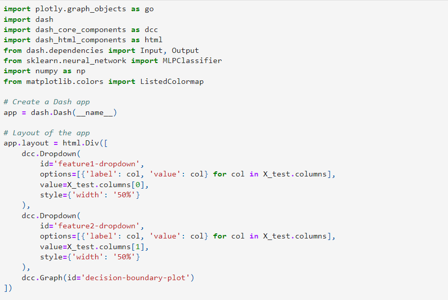
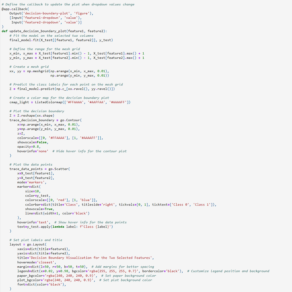

In this visualization, you can interactively select two features, and the plot will display the decision boundary of your machine learning model based on those features. This is an invaluable tool for gaining insights into how your model makes predictions and understanding its classification boundaries in the feature space.
Conclusion
Explainable Artificial Intelligence is not just a buzzword; it's a fundamental component of responsible AI development. As we move forward in the world of AI, understanding and implementing XAI techniques will be essential for building trust, ensuring fairness, and making AI a valuable asset in various domains.


Comments